BuildCore Design System
I created a lean design system for a workflow management system

Our client ran one of the largest real estate development companies in California. By mid-2022, the company was operating on two enterprise workflow management systems. The client was concerned with the subscription cost of operating both systems for its employees.
Over the next few months, we set out to better understand the problem and iterated over the build of a design system that could integrate the two systems together.
My Role
Design System, Interaction Design, Visual Design
The Team
Product Manager, 2 Developers, 1 Designer (Me)
Tools Used
Figma, Whimsical, Google Meet
Timeline
2.5 months, June - Aug 2022
Intro
In an increasingly complex system, how might we create a single source of truth that bridge components between systems?
With its 1000+ employees and contractors split between two systems, there was an ongoing technical challenge to learn and perform the same tasks on two different interfaces.
Hence we decided to focus our efforts on creating a UI on top of the existing back-end database with a familiar content structure to existing users. There was a limited window of time to build the new design system, so I started with the basics before creating new components and styles incrementally.
12
Departments
Each department confusing ran overlapping workflows on a different PM system.
1000+
Employees
Experienced problems re-learning simliar product functions on two platforms.
Project Goals
Our goals for the project was a collection of reusable components that would increase our design and development velocity.
We aligned on the following goals:
Goal #1: Ease, Clarity, Consistency – reduce product complexity and provide more clarity
Goal #2: Rapid Benefits – provide near-term benefits to product and development roadmap
Goal #3: Unify Workflow Offerings – Strategic Planning, Finance, Construction, Architectural
UX Audit
As a first step toward a design system, I conduct an audit of the current styles and components in our two existing systems.
I collected and documented screenshots of the different types of styles and components and grouped them into categories including colors, icons, buttons, navigation, cards, tables, forms, overlays, and other UI blocks.
I partnered with the client and PM to understand what components key to the core functionality of the new product.
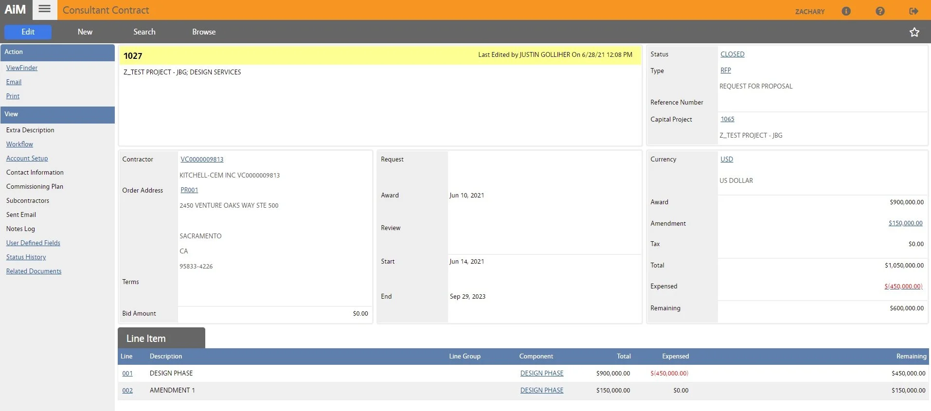
A preview of table elements from the legacy workflow management system.
Colors
Although I love aesthetics, I place a higher value on clear communication.
Color supports the purpose of the content, communicating things like the information hierarchy, interactive states, and the difference between distinct elements. For the design system, every color has a designated role, which specifies how they function within the interface. Defining the color’s roles makes things easy to modify and customize later for cross-platform additions.

Iconography
Icons acted as visual aids to help users complete tasks.
Icons work as visual aids to help users complete tasks. In our design system, I went with Feather and Eva icon libraries because they complimented the overall visual language of the design system. I kept icon sets simple to reduce cognitive load. The key was to help our diverse users (construction workers, architects, financial, etc) easily understand the concepts that each icon represented.
Buttons
To reduce development complexity a few key states were chosen. The most common states are active, hover, focus, and disabled. I decided to use all of these on the platform along with two button types.

Form Fields
The other key category of components I built for the design system is form fields. These are very similar to buttons in the sense that they need to accommodate several states. One of the key things I tried to keep in mind when designing form fields is accessibility. Making sure that the title of the field doesn't go away when selected. There were also other components like drop downs, checkboxes, and toggles, that were important to consider.


Component Library
After organizing the existing components and setting the global style guidelines, the next step was to create a component library.
To keep things simple initially, I created a component library in Figma based on Material Design. In addition to components, I also created templates of data tables to show how the components were grouped together for common use cases. As future approval workflows would be built on the modular components, this made it faster for the design and engineer teams to mock new workflows
Outcome
45% Decrease in Development Time!
I was extremely proud of the amount of time we saved development with scale-able components for upcoming roadmap features. With the new design system, there's no need in creating new components when there are reusable components.
Next Steps
After completing the first design system, I would like to take design ownership and partner with the engineers to ensure the new design system is efficient, secure, and consistent throughout as we move forward with new product features.
Many micro-interactions were scaled back and warranted revisiting and testing to improve usability. I would also like to document a few templates and pages in line with Atomic Design principles to speed up workflows with similar layouts.